
Fall Design Trends: Tone & Texture
What’s popular in design is always changing, but trends rarely vanish completely. Instead, they are often reimagined in new ways as our lifestyles and preferences evolve. Over the past few years, we’ve seen interiors gradually move away from bright, ultra-minimal spaces toward homes that feel warm, layered, and personal. The focus is becoming less about perfection and more about creating spaces that tell your story. Rather than chasing every new idea, we think it’s more valuable to explore where design is heading and incorporate inspiration that feels authentic to your style.
A RICHER PALETTE
We love a moody moment, so when fall comes around, we get especially excited. While color can seem intimidating, the homes that leave the biggest impression are often the ones willing to break away from the expected. When used thoughtfully, color can completely transform the atmosphere of a room.
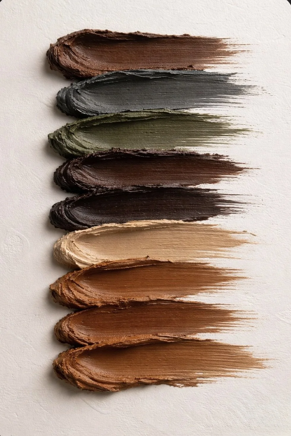
This fall, look a little closer at the colors happening right outside your window. We all know the leaves turn orange and yellow and the sky gets a little darker, but the changing seasons bring some of the most beautiful inspiration: earthy greens and browns, warm golden tones, muted oranges, and deep blues. When bringing these colors into your home, consider experimenting with shades just outside your comfort zone. If you’re already replacing pillow covers, try introducing a muted color into the mix. Thinking about an accent wall? Go one shade darker than you normally would—you might be surprised by how much you love it. Artwork is another great way to bring in the colors of fall without making a major commitment. A palette inspired by nature is nothing new—we’re simply seeing it embraced in bolder ways.
While color adds personality and depth, neutrals will always be the foundation of a timeless home. Neutral palettes take on new tones to reflect the way we want our spaces to feel. Today, we’re seeing softer whites, warm taupes, mocha browns, and charcoal blacks. The beauty of neutrals is their ability to adapt with the seasons while providing the perfect backdrop for bringing individuality through color.
THE DETAILS YOU CAN FEEL
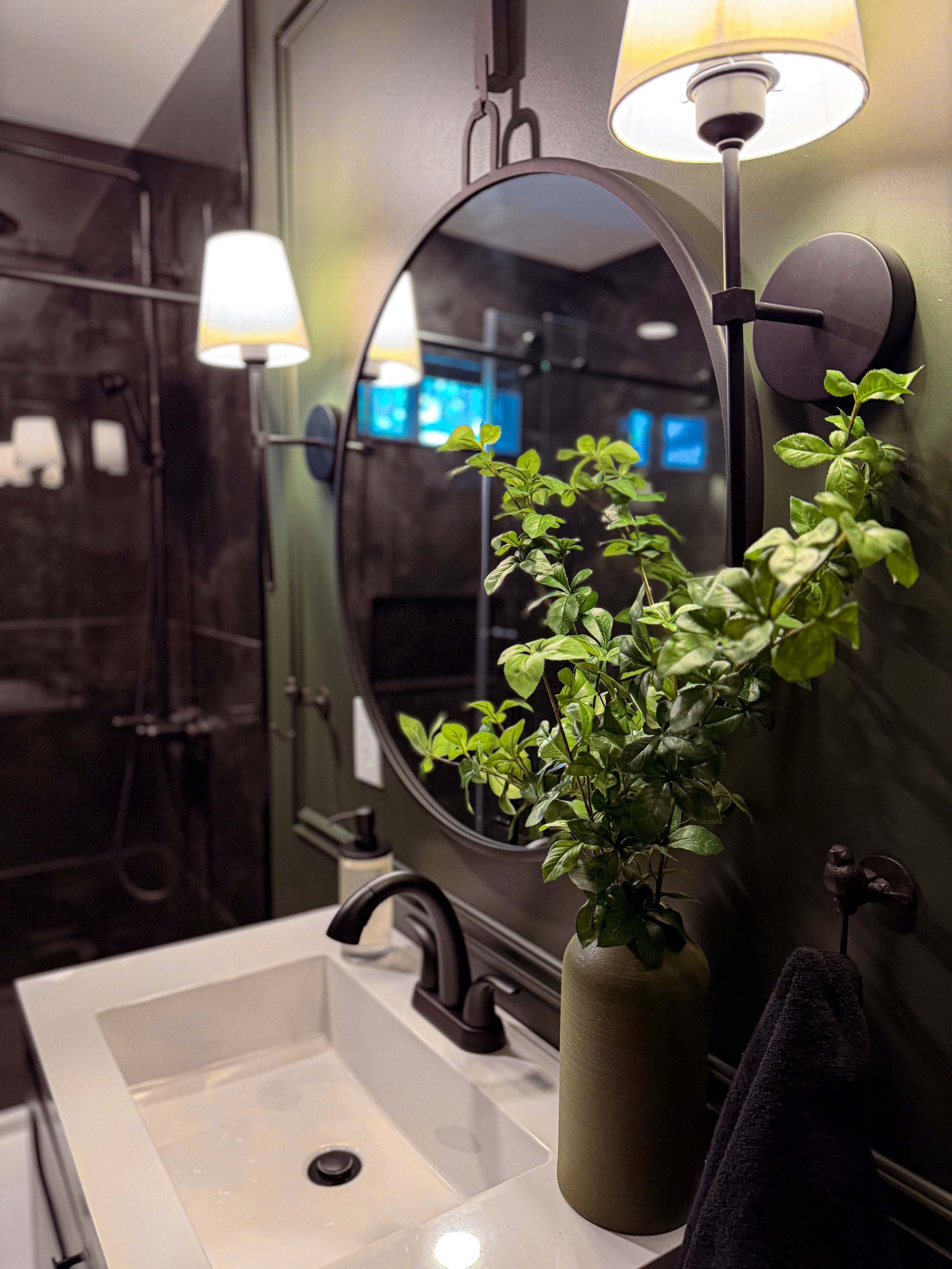
One of the biggest movements we’re seeing in our industry is an emphasis on high tactility—the idea that a room should not only look beautiful but also invite you to experience it through touch. Material selections go beyond appearance; it’s about the details that draw you in and encourage you to look closer. We’re embracing dimension, craftsmanship, and the subtle variations that make interiors unique.
We often notice texture in fabrics, but this desire for tactility is expanding into every surface of the home. We’re seeing walls become more intentional through millwork, smooth plaster, and limewash. Finishes are being celebrated for their natural character—unlacquered brass, wood grain, and handmade tile, where each variation adds to the beauty rather than taking away from it.
That same appreciation is being carried into the elements we layer throughout a space. A carved marble bowl, textured glass light fixture, woven picture frame, or seasonal greenery can all add depth and interest. We’re seeing an emphasis on how much every surface—from soft and smooth to rough and irregular—can contribute to the way your home is experienced.
INSPIRATION, NOT INSTRUCTION
Trends will continue to come and go, but the elements that make a home feel personal will always remain timeless. Whether you embrace a new color, add texture through small details, or simply appreciate the ideas influencing design, the most interesting spaces are the ones that reflect the people who live there.